Role: Editorial Designer - Academic
Key Skills: Layout and Publishing Design
Timeline: Two weeks
Teams: Patricia Sugiarta, Andy Cheng, Joyce Tng, Veronika Tatsiy
Tools: Figma & Adobe Indesign
Project Overview
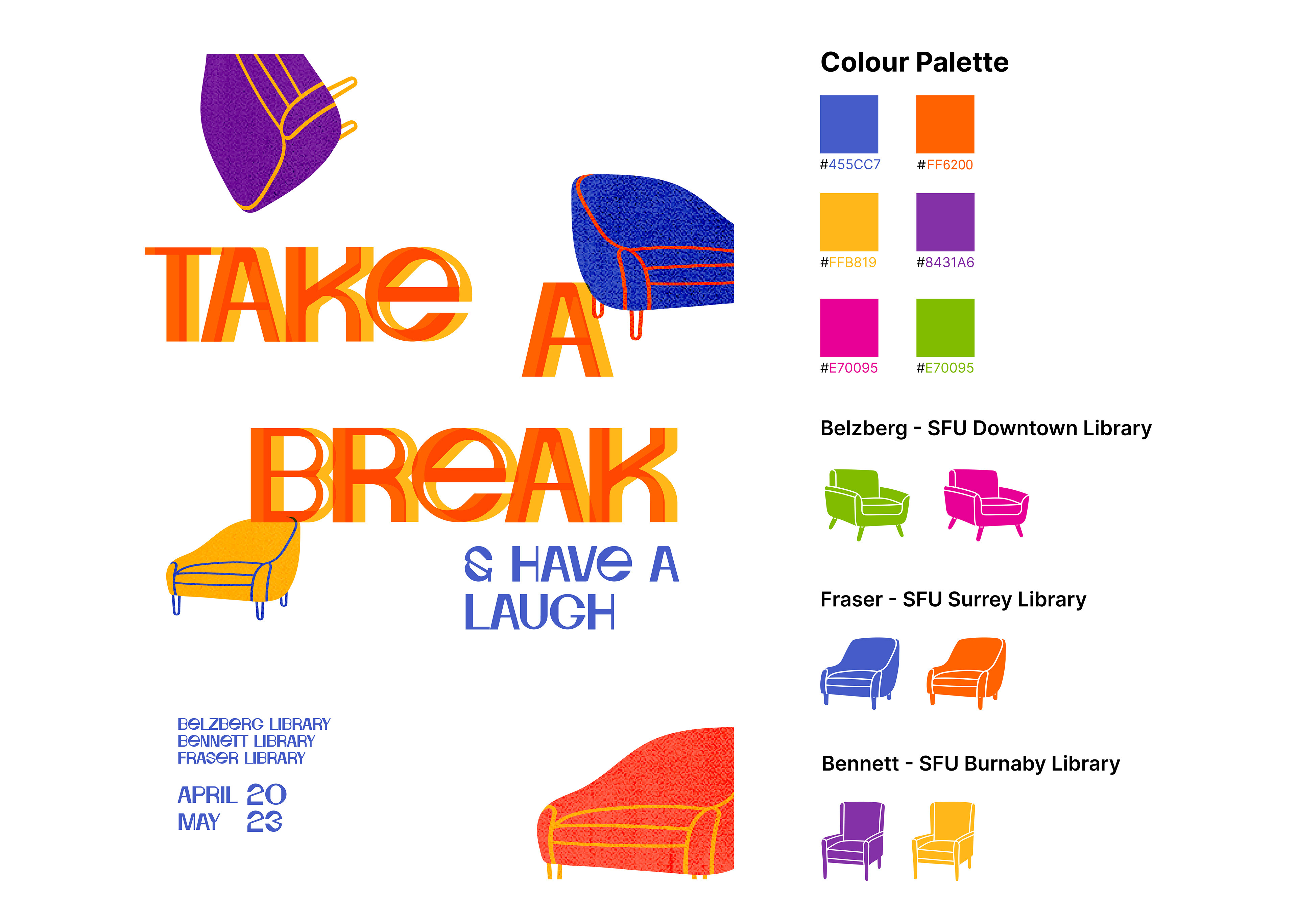
"Take a Break" is an exhibition curated by the Publication Design Project (PUB431), held across three SFU main campus libraries: Bennet, Fraser, and Belzeberg. The showcase will feature students exploring the theme of Entertainment through innovative publications. Our team has been tasked with creating the exhibition's catalogue.
BRAND IDEntity
Brainstorm
Individually, we each contribute to brainstorming and experimenting with diverse layouts for the catalogue, exploring various design elements and arrangements that best capture the essence of the exhibition. Collaborating as a team of four, we opt to utilize Figma for its collaborative features, intending to transfer the finalized design to InDesign at a later stage.
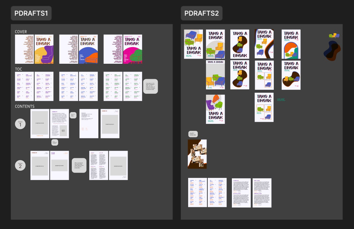
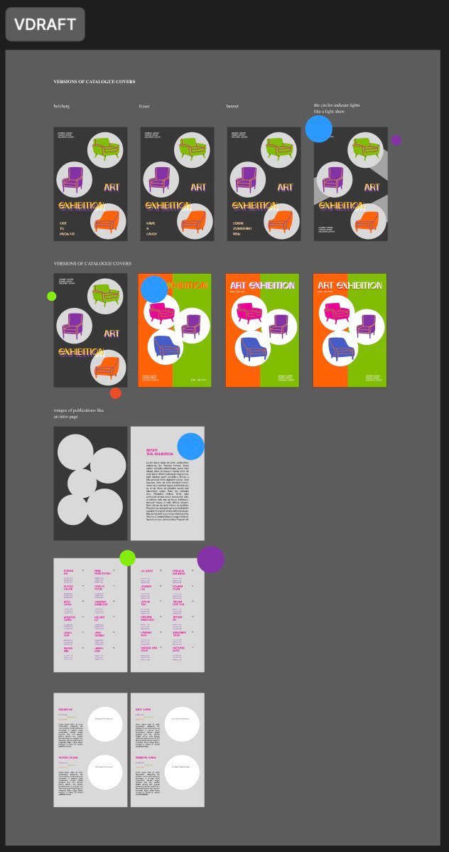
Next, we vote and agree as a team to move forward with the chosen layout, confident that it effectively communicates the exhibition's spirit.
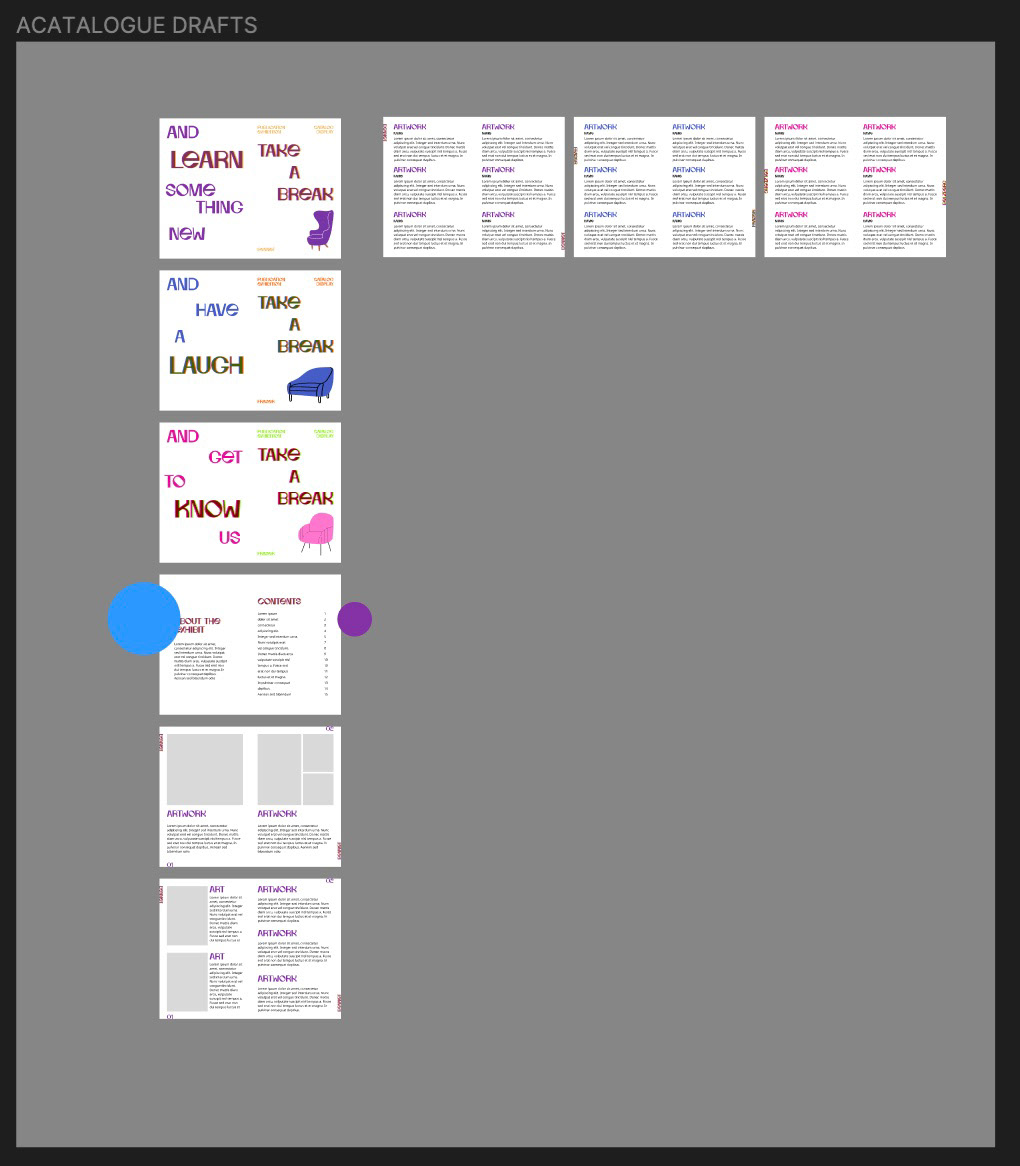
Cover DRAFTS
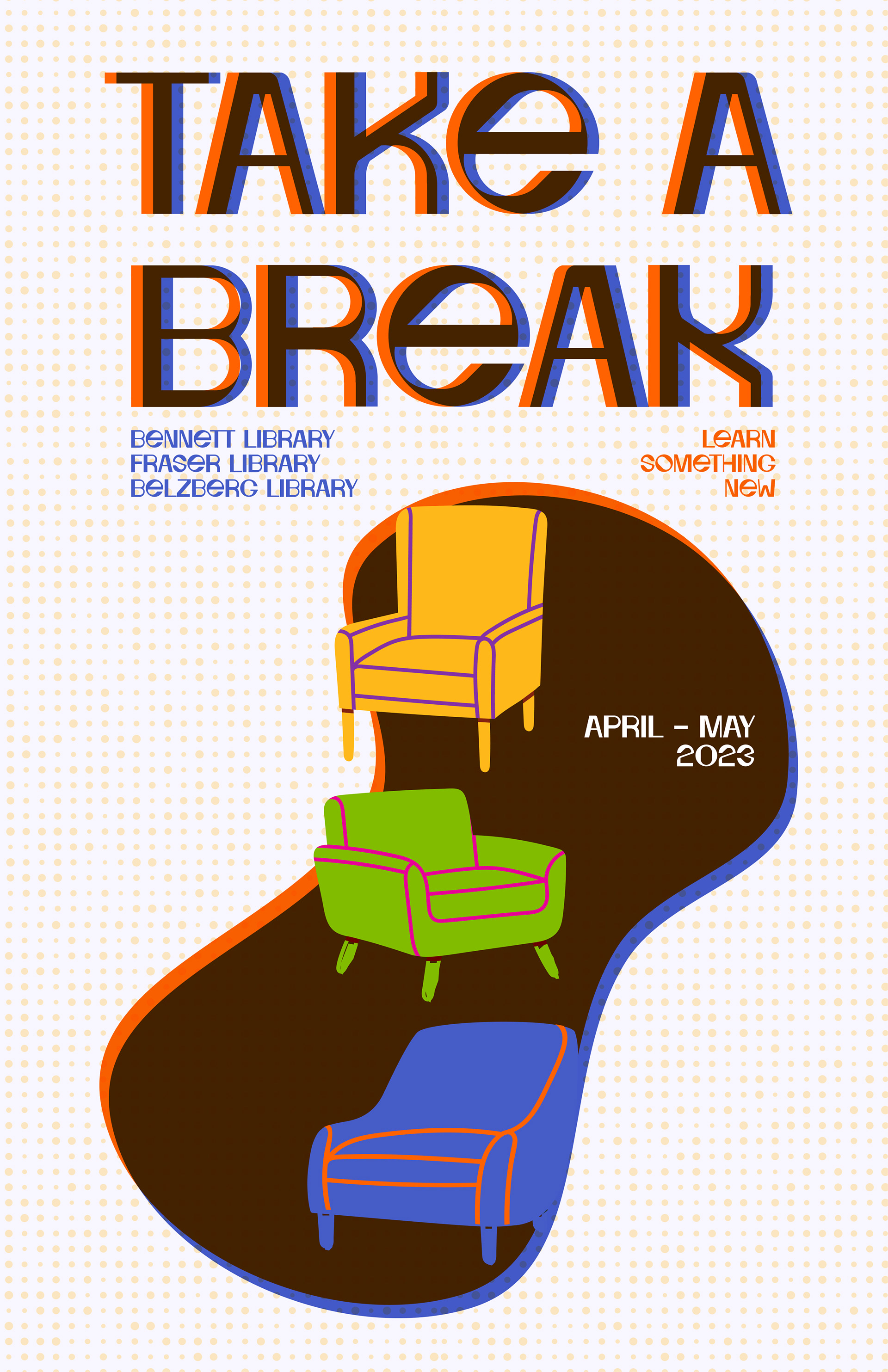
After adding some details to the cover, we encountered an issue during test printing: the dot background wasn't visible. Our professor suggested creating different versions for each library to address this.
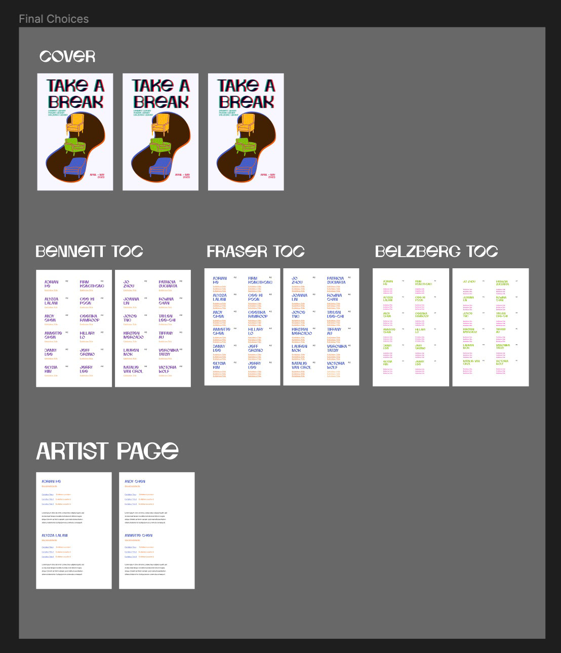
We start the drafting process for the cover customized to suit each library, prioritizing the integration of the respective branding colour palette to ensure consistency and coherence with the cover design.
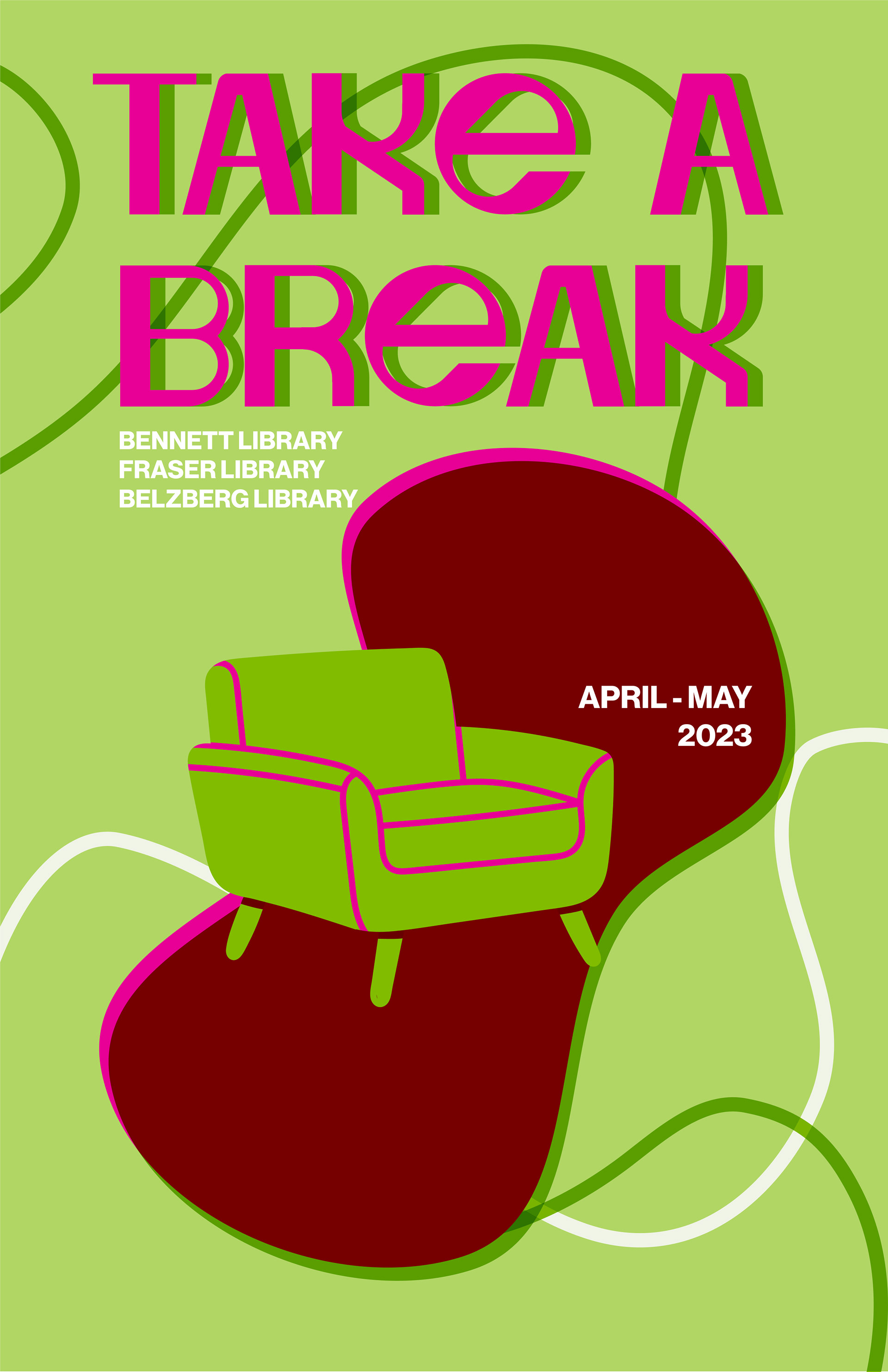
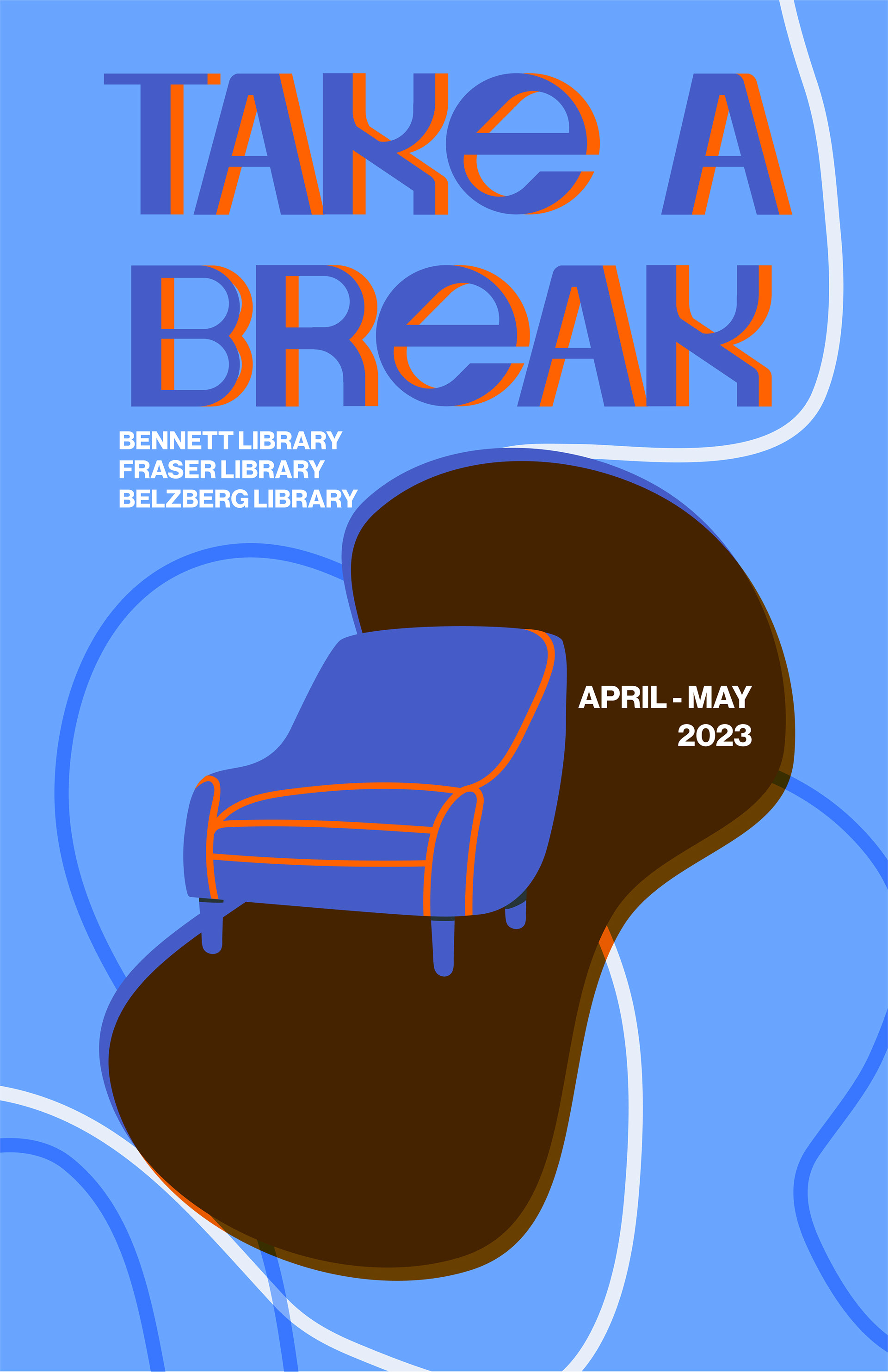
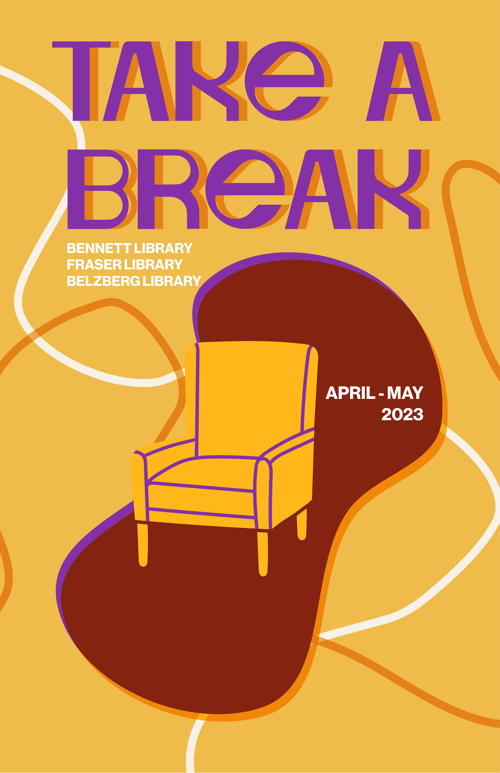
After experimenting with various compositions and scales for the elements on the cover, I finally discovered the optimal layout. Integrating a brief exhibition description and placing additional details on the lower right side fosters a seamless flow of visual engagement. By adjusting the size of the chair, I create an illusion of depth, enhancing the cover's overall appeal and intrigue. Lastly, I design the back cover to maintain a consistent style while preserving continuity with the front cover.
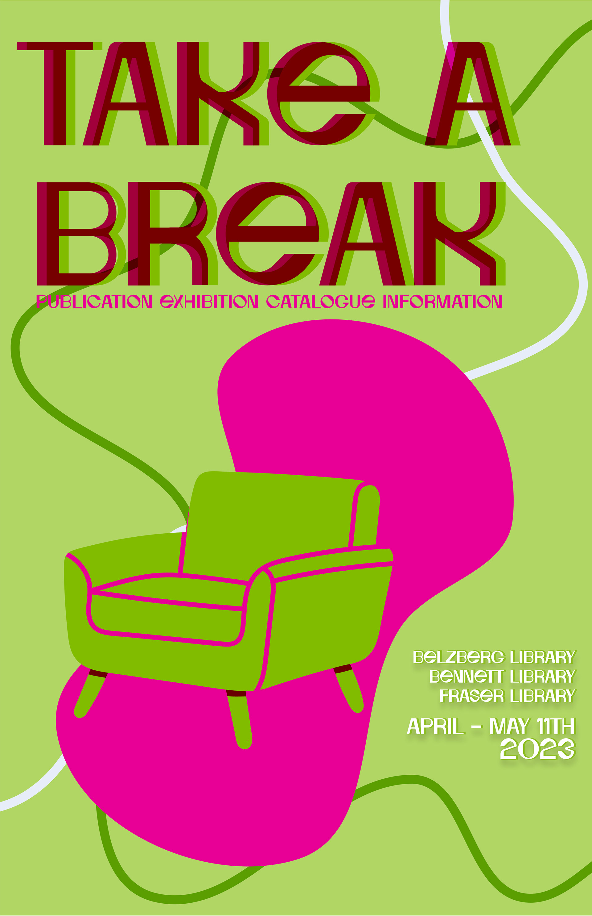
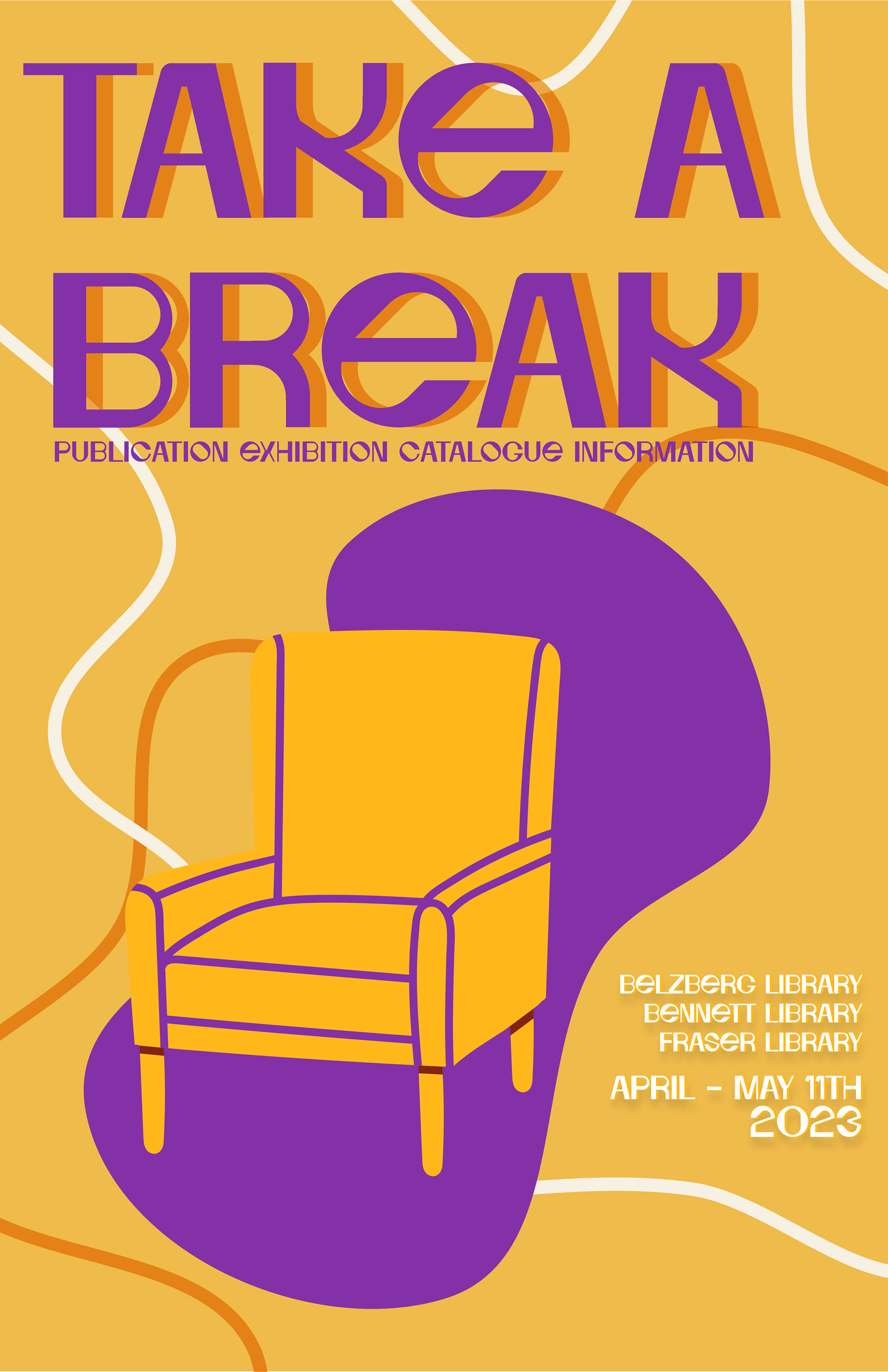
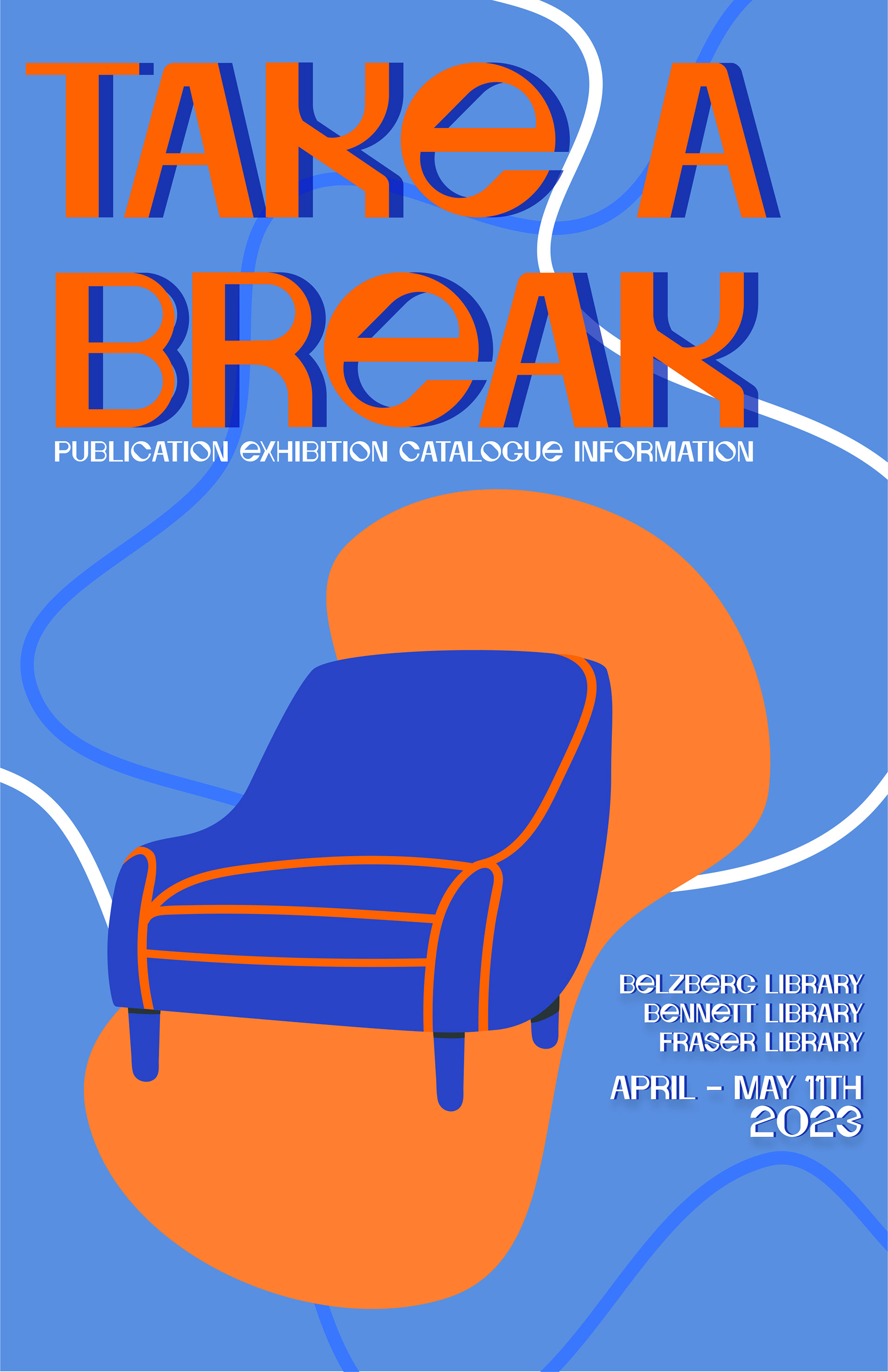
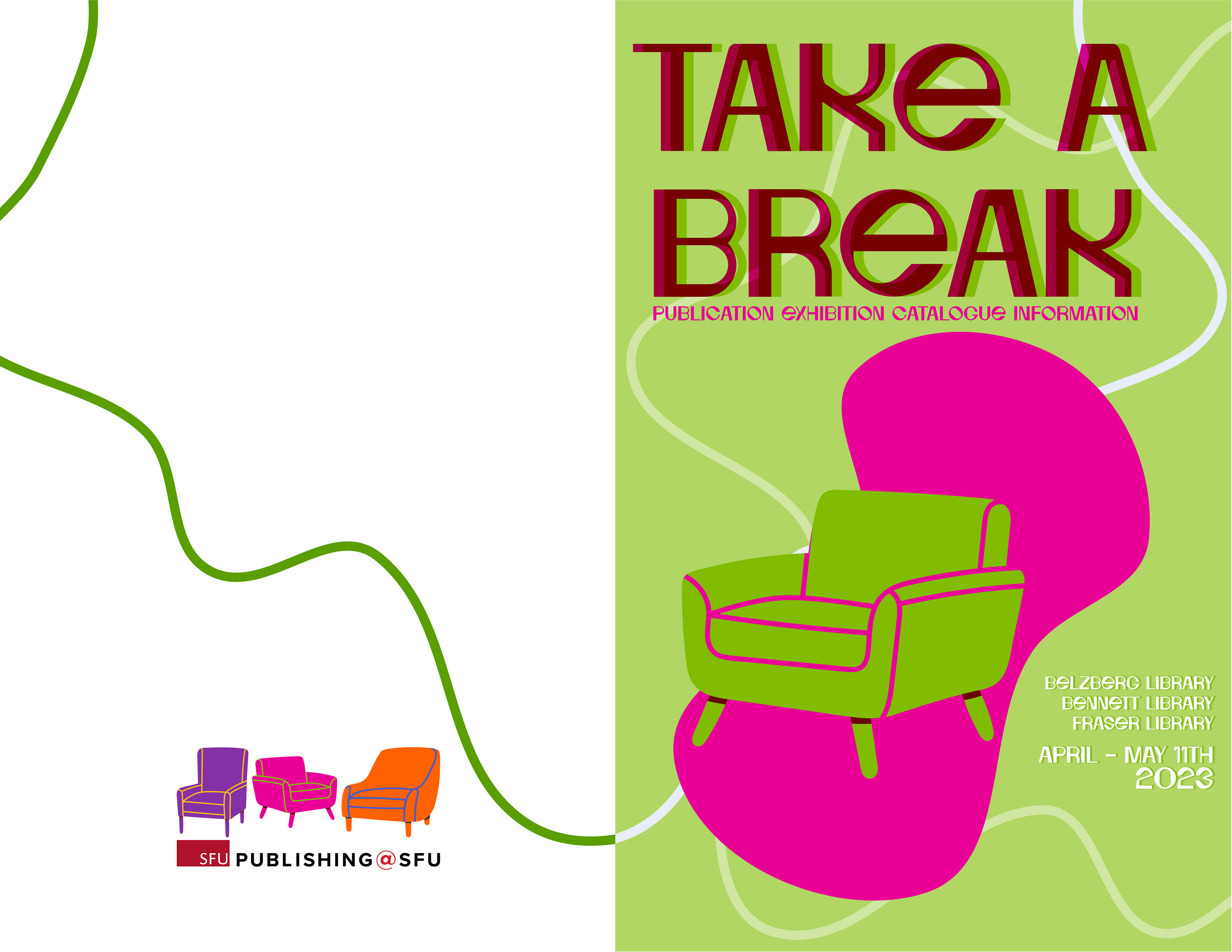
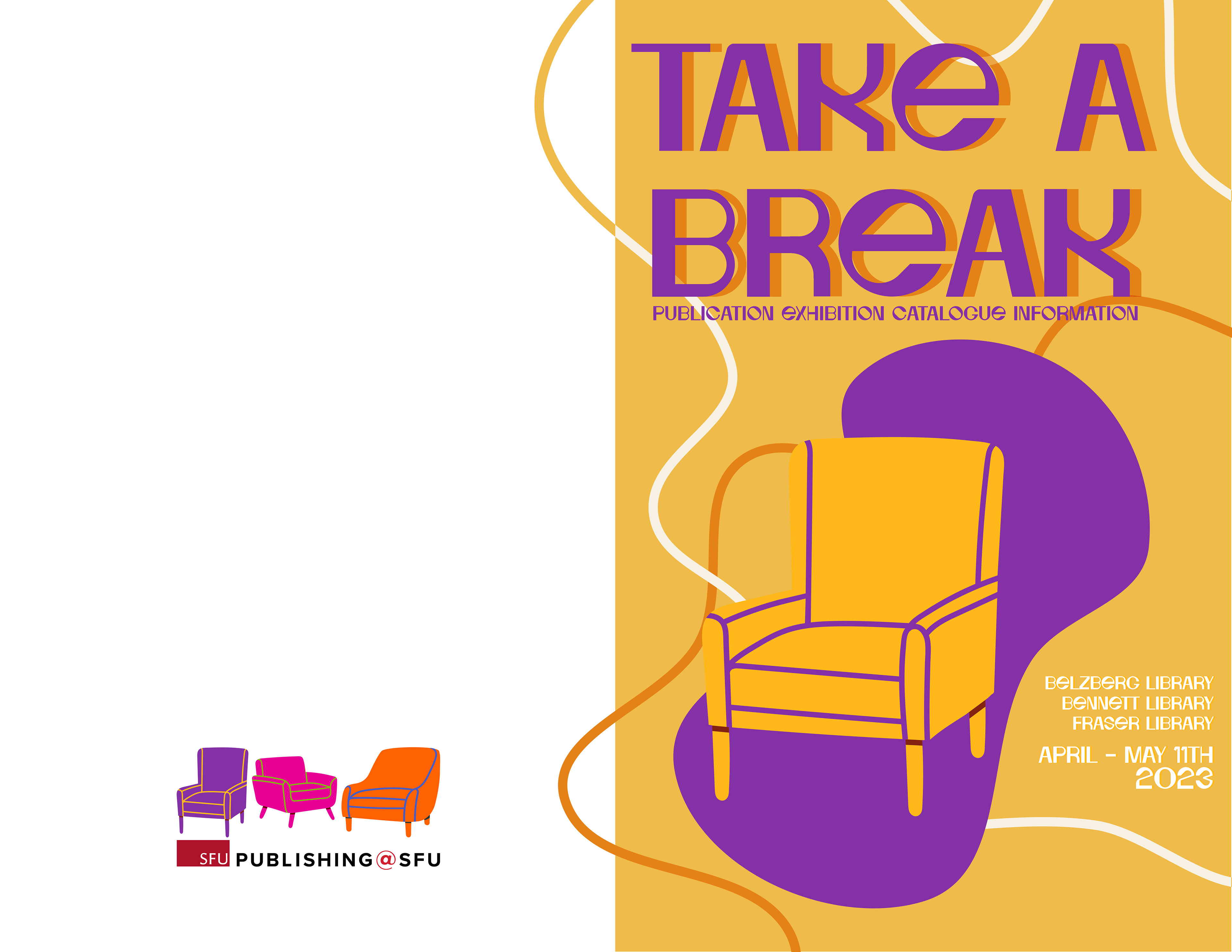
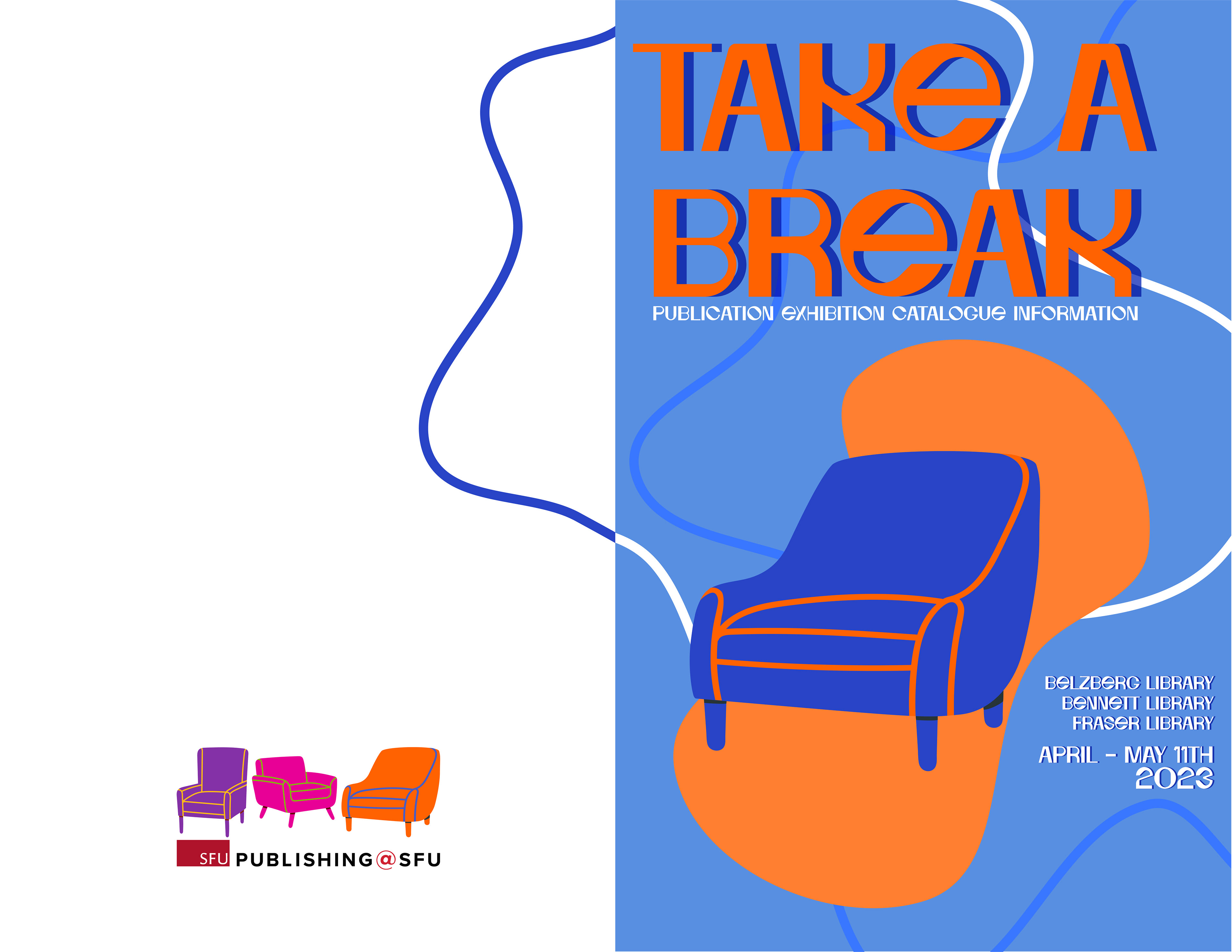
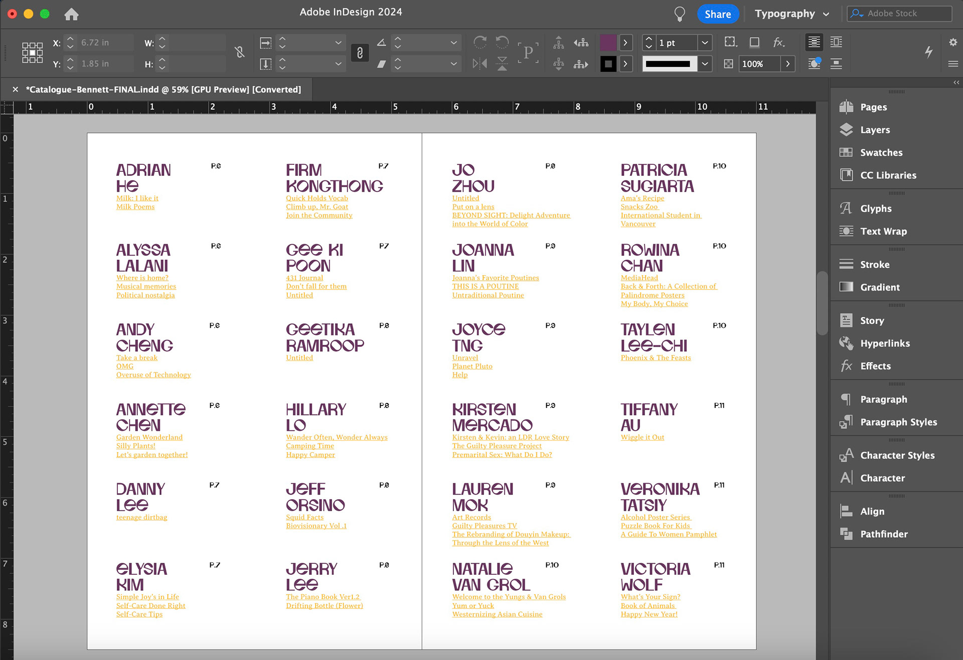
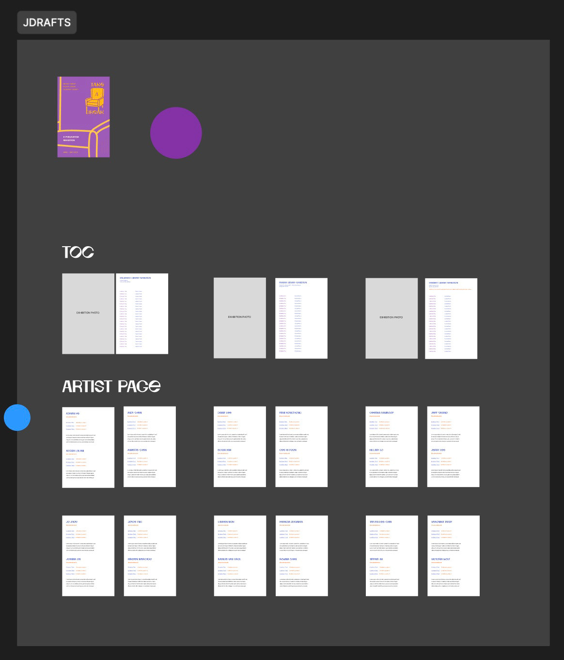
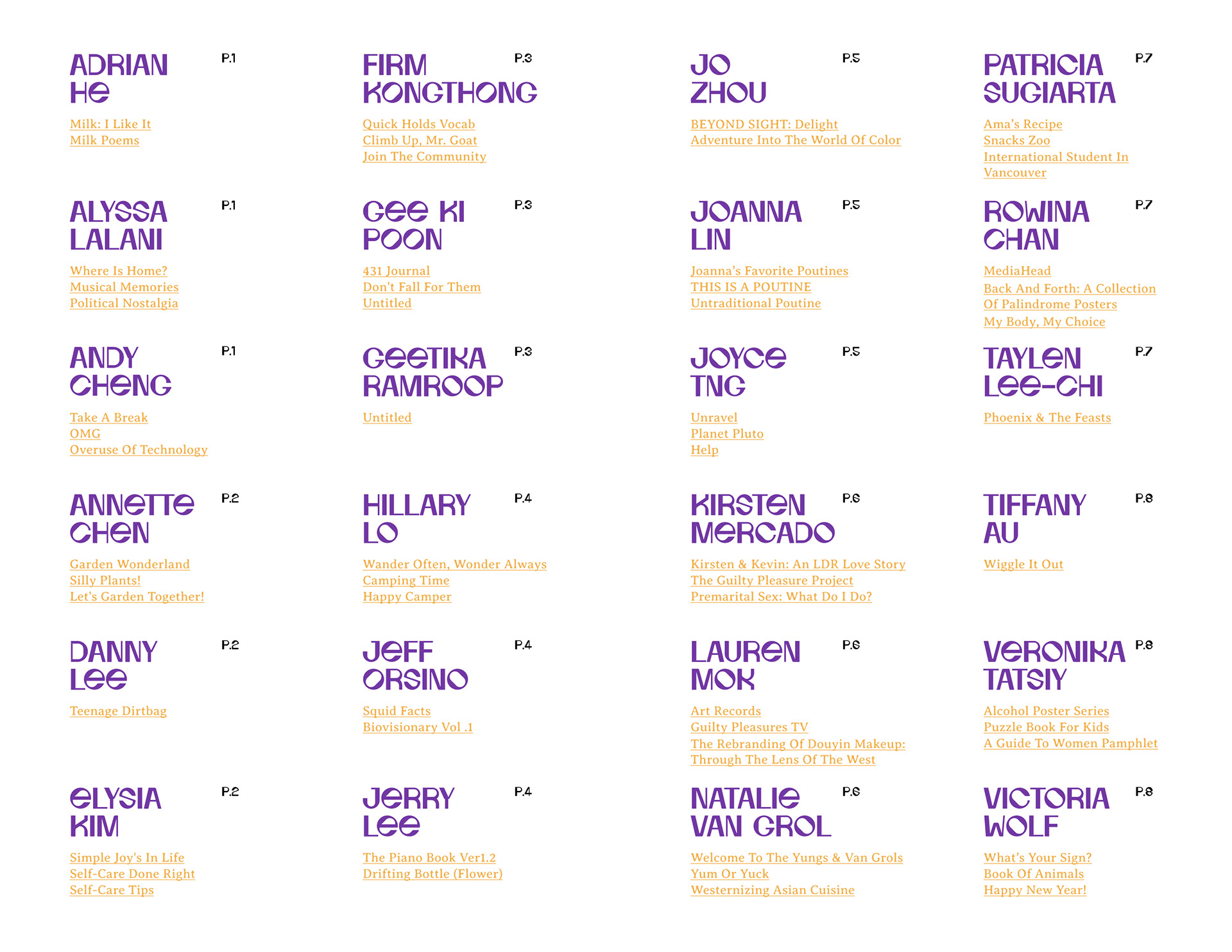
Table Of Contents
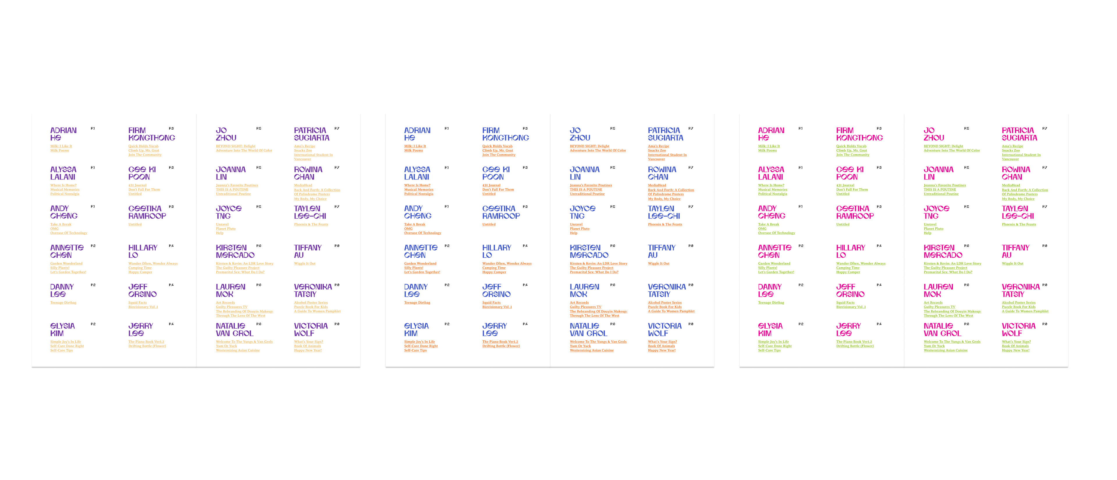
For the table of contents, we have agreed on the style from the beginning. We made small changes, which are changing the font size and following the colour based on the front cover colours.
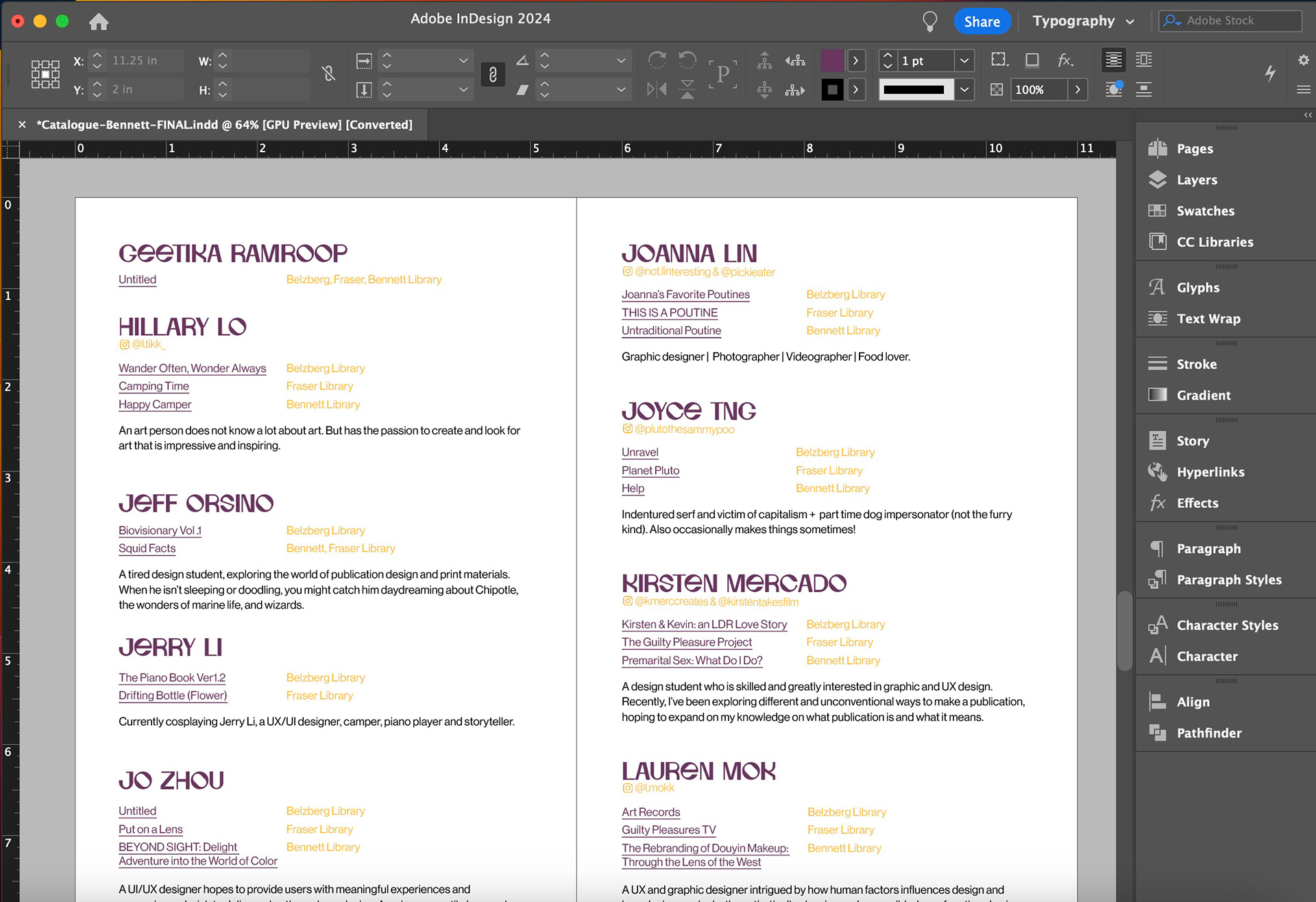
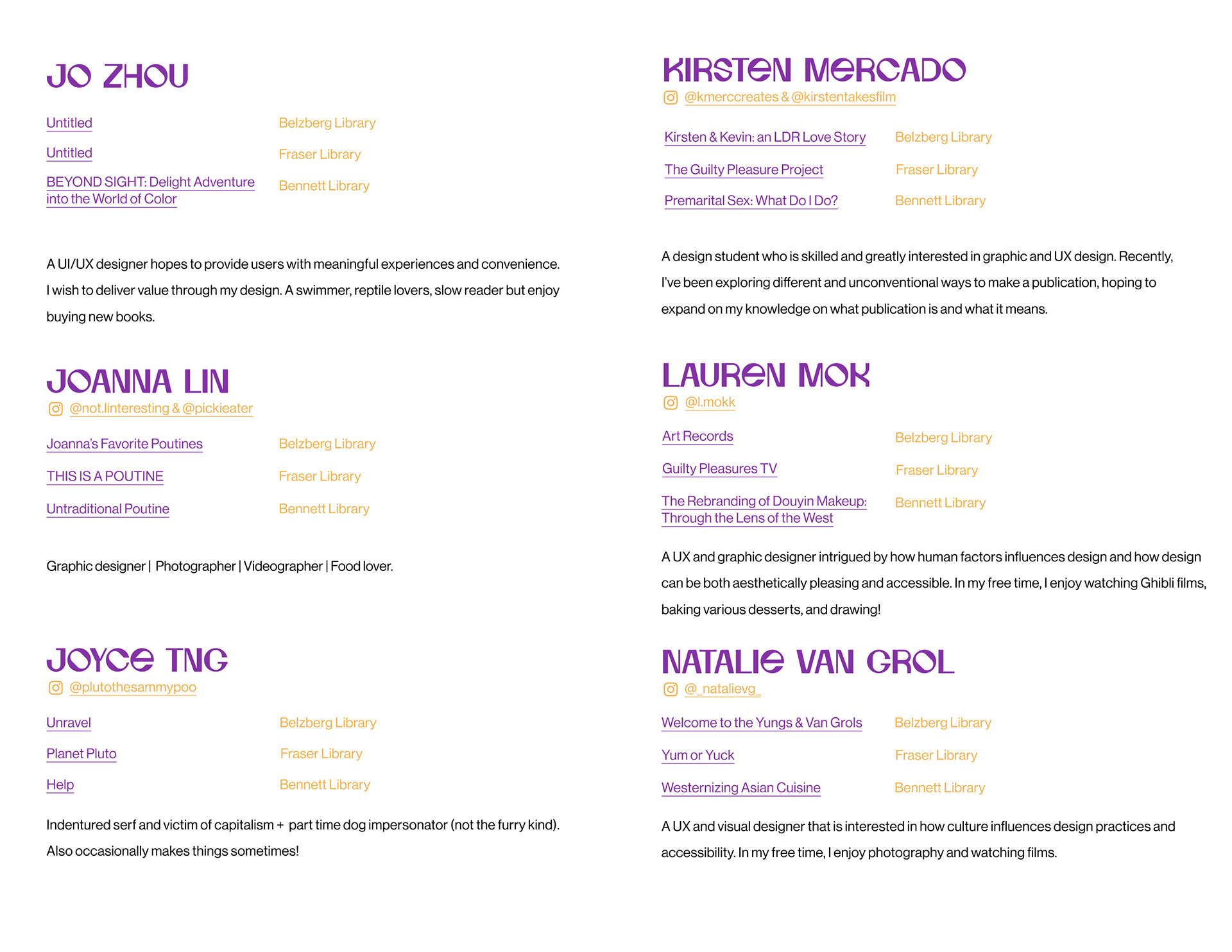
ARTIST PAGE
Initially, we planned to include publication images on the artist page. However, since several students still needed to finish their publications, we recognized the potential for inconsistency on the page if we proceeded as planned. Consequently, we opted to continue with the pages without images. To compensate for the lack of images, we decided to add social media links or portfolio information to facilitate ongoing communication with the students.
Convert to InDesign
After finalizing the pages' design, I converted the layout to InDesign using a 12x12 grid. While Figma typically utilizes RGB colours suited for digital publication, I switched to CMYK colour mode in InDesign for printing purposes. Consequently, InDesign's colours appear darker than those in Figma due to the differences in colour rendering between RGB and CMYK colour spaces.