Role: Graphic Designer - Co-op
Key Skills: Branding, Layout Design
Tools: Adobe Illustrations, Adobe Photoshop
Project Overview
The Indigenous Cultural Safety Speaker series is held every month from September to March. Seven Indigenous Leaders and educators share their knowledge and expertise on important Indigenous health-related topics through the one-hour session. This series allows Fraser Health and medical staff to learn, reflect and renew their commitment to Indigenous cultural safety and anti-racism.
Brainstorming & Rough Sketch
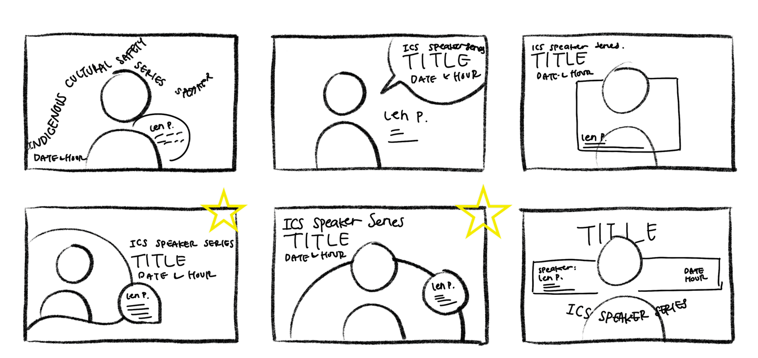
I started brainstorming by sketching the layout design of the poster based on the elements they gave me. My sketches are based on geometrical elements to communicate a fun-formal event. After exploring different layouts, I picked two strongest ideas from my rough sketches. However, there will still be possibilities for developing the graphics and brainstorming more once I move from physical to digital. As I developed more and more, I decided to focus more on the 2nd stared sketch as the idea for creating the mock-up draft.
DRAFTS
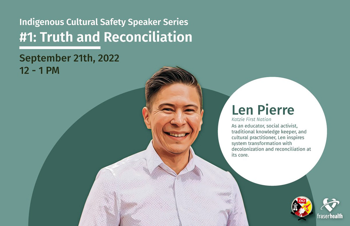
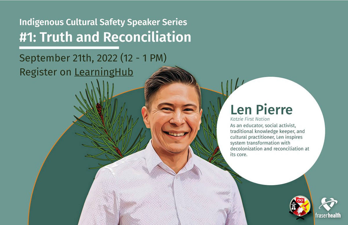
Every speaker is unique. Therefore, in this speaker series, I aim to embrace each speaker’s background and value in each poster while developing a consistent graphic element. I chose green because the speaker’s website shows that he loves cedar and nature. After making the first draft, I felt the poster was too plain and might need to add some elements.
I added the cedars to embrace and represent more of the speaker’s uniqueness. Also, I got some feedback from my co-workers:
• Change the cedar graphic because it's like a confetti
• Try to integrate some oranges because of the topic.
• Add a call in action to register
• Change the cedar graphic because it's like a confetti
• Try to integrate some oranges because of the topic.
• Add a call in action to register
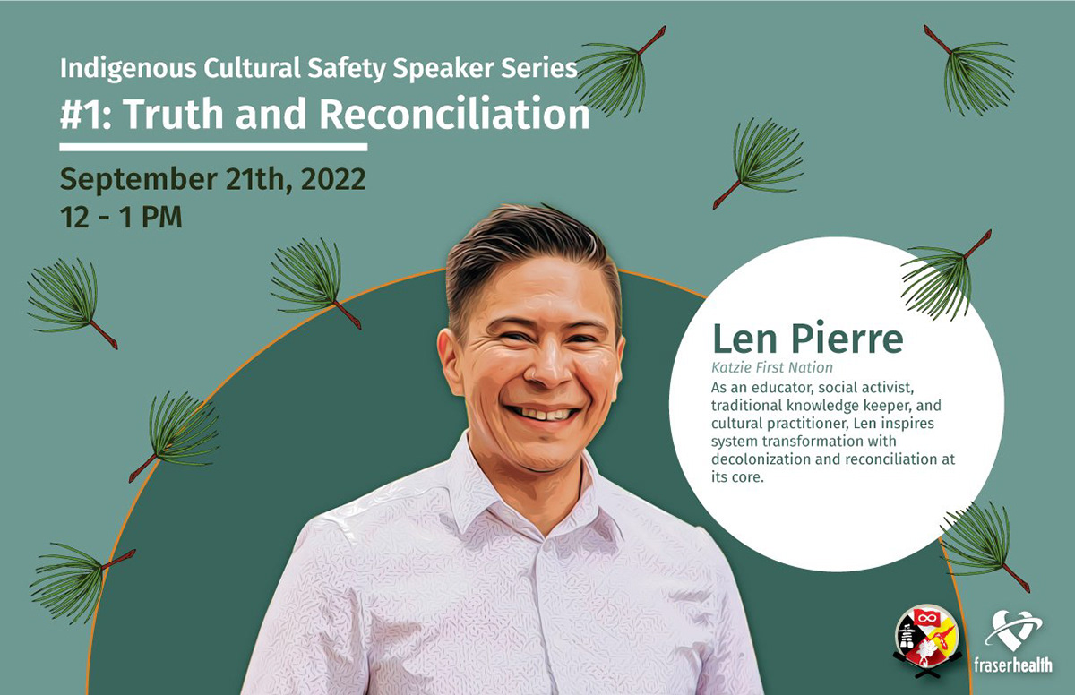
In the final draft, I made a few changes to the peer feedback that I got from the previous draft. However, I still got some feedback from my colleagues:
• Change the cedar because it makes the speaker have a wing
• Adding a stroke to the biodata bubble will be a good idea to maintain consistency.
• Extent or remove that line you have under the title; it seems off that it stops halfway through
• Make the call in action more recognizable
• Change the cedar because it makes the speaker have a wing
• Adding a stroke to the biodata bubble will be a good idea to maintain consistency.
• Extent or remove that line you have under the title; it seems off that it stops halfway through
• Make the call in action more recognizable
Final Cover
For the final cover, I implemented all the feedback that I received and was happy with the result. I kept the cedar elements to represent the speaker’s characteristics and added more cedar silhouettes to add some details to the background. Also, I have added the orange stroke to give an integrated Truth and Reconciliation colour. Furthermore, I have made the call to action to be a button that directly provides the audience access to the sign-up website.
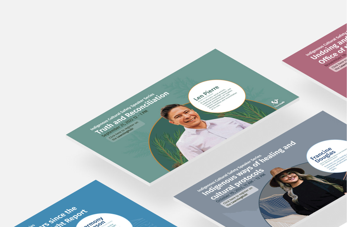
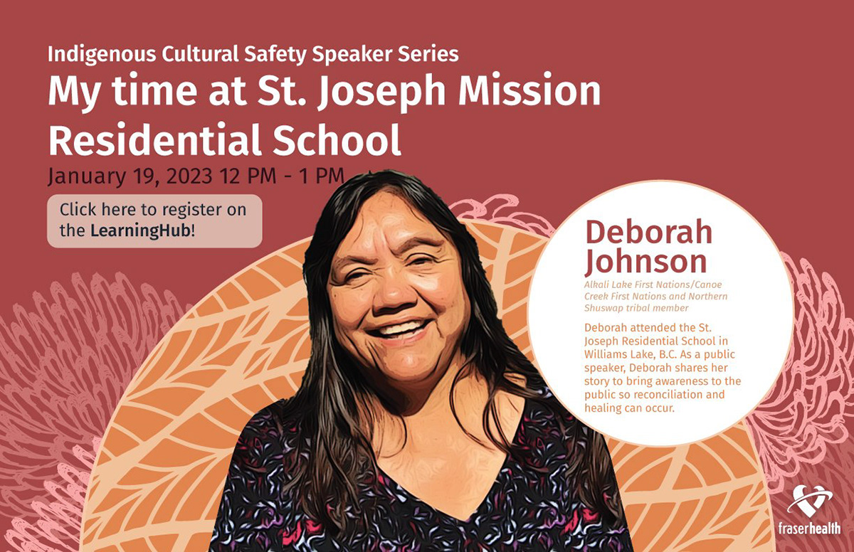
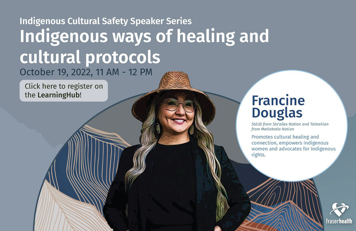
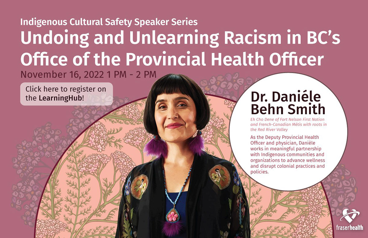
Since the first speaker series poster was finalized, I have asked the speakers what their favourite colour is and an element to be added to the poster for their representative. Here are the posters that I have made:
Since the first speaker series poster was finalized, I have asked the speakers what their favourite colour is and an element to be added to the poster for their representative. Here are the posters that I have made:


Takeaways
This project taught me the importance of colour and consistency and details matter. I have learned that a little difference in the hex colour has a big effect on the outcome of the poster, even if the difference is not much. On the other hand, including elements that resonate with the speakers makes its series unique for its own
Overall, I am happy with how the outcome turns out, and the poster can attract people to exceed our maximum capacity of each speaker series.
Overall, I am happy with how the outcome turns out, and the poster can attract people to exceed our maximum capacity of each speaker series.